prove: ENTERTAINMENT #footer { border-top:1px dotted #999999; clear:both; margin:0 auto; }

Breaking

Home Top Ad

Responsive Ads Here

Post Top Ad

Responsive Ads Here
Showing posts with label ENTERTAINMENT. Show all posts

Wednesday, February 21, 2018

10 Fascinating Facts Behind World-Famous Logos

A logo is something that defines a brand. It defines what a company stands for and how consumers can associate themselves with the brand. Companies spend millions of dollars in the design of their logos so that they can have unique logos to stand out from their competitors. We see hundreds of logos every day, but there are a few that just stick in our minds. Maybe it’s the colors of the logo or a hidden element that adds to the aesthetics. We bring to you ten such fascinating facts behind world-famous logos.

1. The FedEx logo has an intentionally hidden white arrow between the letters “E” and “x” that was created by blending two different fonts together. It has won over 40 design awards and is renowned for the best use of negative space.

FedEx Express
Image credit: Tomás Del Coro/Flickr
The FedEx logo is one of the most recognized logos in the world. But the bold lettering and bright colors of the logo are not what makes the logo great. It’s the hidden arrow between the letters “E” and “x” that adds a certain charisma to the logo and is the perfect use of negative space. The design is both simple and clear.
Lindon Leader designed the FedEx logo in 1994. This logo is a legend when it comes to designers. It has won around 40 design awards and had been termed as one of the best logos, out of the top eight, to be designed in the past 35 years.
When Lindon started working on the logo for FedEx, the CEO Fred Smith said two things, “You can make them pink and green for all I care; just give me a good reason why. My trucks are moving billboards. I better be able to see a FedEx truck loud and clear from five blocks away.”
Lindon started working keeping these two things in mind. While he was tweaking with the letters, he saw a small arrow appear between the letter E and x. He had to mix the best qualities of two different fonts, Univers and Futura Bold, to make the arrow look natural and unforced. When few final designs were showcased to FedEx, the CEO was the first to notice the hidden arrow in Lindon’s design and everyone loved it!(source)

2. VLC Media Player uses a traffic cone as its logo because the students who wrote the code for the VideoLAN project had a traffic cone collection.

VLC Media Player
Image credit: Logevent/Wikimedia
We have all wondered at some point in our lives what the traffic cone in VLC Media Player stands for. Well, today you can put all your speculations to rest! The creator of VLC Media Player is the ViaRézo Association of the École Centrale’s Networking Students’ Association. Once, some students from the association came back drunk with a traffic cone. They then started a cone collection.
When the VideoLAN project began to develop the VLC Media Player, they decided to use the cone as their logo.(source)

3. The logo for Domino’s Pizza has three dots because there were only three original Domino’s stores in 1965. They planned to add a new dot for every new store, but the idea was dropped due to the fast growth of the franchise.

Domino's Pizza
Image credits: Purplellamas01/WikimediaDomino’s Pizza, Inc./Wikimedia
Domino’s was originally DomiNick’s, a small pizza store that was purchased by Tom Monaghan and his brother James. The brothers decided to split their time to run the business. But James was not willing to let go of his full-time job as a postman to run the pizza business. He quit and sold his half of the business to Tom.
By 1965, Tom purchased two additional pizza stores and expanded his business. He wanted all the three stores to share the same brand name. When the original owner of DomiNick’s forbade him from using that original name, Tom renamed the stores Domino’s after a suggestion from one of his employees.
Since the business was comprised of only three stores at that time, Tom decided to add three dots to the logo. He also planned to include one dot for every new store that he added to the brand. But the business expanded so fast that Tom had to drop the idea. If they had continued the idea, the logo would have had more than 13,000 dots by now!(source)

4. The Walt Disney logo is not based on Walt’s own signature. It is, in fact, based on an employee’s version of it who used to sign fan mail on Walt’s behalf. The stylized version got so famous that Walt Disney had problem signing his own autographs!

Walt Disney Logo and Signature Logo created by artists
Image credits: OswaldLR/WikimediaWalt Disney Pictures/Wikimedia
The Walt Disney logo is recognized by people all across the world and across all age groups. The original logo had just the words “Walt Disney Presents.” The image of the castle was added much later.
But that is not the intriguing part. Most of us believe that it’s Walt Disney’s signature that appears on the logo. But that is not the case. It is, in fact, a stylized version of Walt’s actual signature created by a group of artists.
When the company started to grow, Walt didn’t have much time to sign every piece of fan mail that he received. His secretary and some other employees were the ones who would take care of fan mails and sign them on Walt’s behalf. This led to a situation in the 1940s where there existed more fake versions of Walt’s signature than actual and original ones. The stylized version became so popular that it gave Walt Disney a hard time while signing autographs. Over the years, Walt tried to change his signature to match the stylized version, but you can still see the difference.(source)

5. The logo for Bluetooth, which was named after the Danish King Harald Bluetooth, is derived from the Danish letters that represent the king’s initials – H (ᚼ) and B (ᛒ).
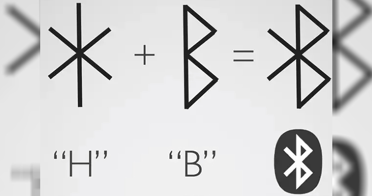
Bluetooth
Image source: steemit.com
Ericsson named their revolutionary technology “Bluetooth” after Harald Bluetooth who ruled Denmark as their king between 958 and 986 CE. During his rule, he introduced Christianity to Denmark and Norway and contributed to the unification of various Danish tribes under one kingdom. This analogy was used while naming the wireless technology Bluetooth because, just like the king united people, the technology enabled the unification of various devices and made communication between them easier.
The logo is designed by using a bind rune. A bind rune is basically a combination of runes or letters that were used to write Germanic languages before Latin letters were adopted. In the logo, the two Younger Futhark runes, or more commonly called Scandinavian runes, that represent the king’s initials are merged – ᚼ (Hagall) and ᛒ (Bjarkan).(source)

6. The Ferrari prancing horse logo originally decorated the plane of Count Francesco Baracca, Italy’s top fighter ace of WWI. After Francesco was shot down, his mother said to Enzo Ferrari, “Ferrari, put my son’s prancing horse on your cars. It will bring you good luck.”


Image source: Wikimedia, Image credit: Brian Snelson/Flickr
Racing fans have the Ferrari’s prancing horse logo etched into their minds. We all know that the famous logo has a black, prancing horse on top of a bright yellow background with the letters “S” and “F” inscribed on it that stands for Scuderia Ferrari. What some of us might not know is that the prancing horse was the symbol of the legendary Italian Air Force ace Count Francesco Baracca. He lost his life during World War I after accomplishing 34 victorious duels and many team victories. He had the prancing horse symbol painted on his fighter plane.
When Enzo Ferrari met with Francesco’s parents, his mother suggested that Enzo should use the prancing horse symbol on his cars and that it would bring good luck. It was only 12 years later that Enzo Ferrari would use the symbol on Scuderia cars at the race of SPA 24 Hours in 1932. Ferrari won the race. Since then, the prancing horse has been kept black as it was on Francesco’s plane. Ferrari only added the yellow background to symbolize the color of his birthplace, Modena.
Ferrari is not the only company to have used the prancing horse symbol as part of their logo. Fabio Taglioni used it on his Ducati motorbikes. But as Ferrari’s fame grew, Ducati dropped the prancing horse logo. Now it is entirely a trademark of Ferrari.(source)

7. The Apple logo has a bite taken out of it simply so that it would not be mistaken for a cherry.

Apple Logo
Image credit: Ron Cogswell/Flickr
There are many stories behind the Apple logo. One tale that was believed by many for a long time was that the Apple logo was designed to pay tribute to Alan Turing, the legendary man who laid the foundations for the modern computer and brought into life the concept of artificial intelligence. He was humiliated for his homosexuality and when he couldn’t take it anymore, he bit into an apple that was laced with cyanide. So, when the Apple logo was unveiled, people believed it represented the apple that Turing took a bite from to end his life.
But in 2009, during an interview with CreativeBits, Rob Janoff, the creator of the Apple logo, debunked all myths related to the logo. He mentioned that the reason for the bite on the apple was purely for scale purposes so that a small Apple logo would still look like an apple and not a cherry.(source)

8. The Baskin-Robbins logo has a “31” cleverly inscribed on the name that represents a flavor for every day of the month.
Baskin-Robbins Logo
Image credit: Baskin-Robbins/Wikimedia
Baskin-Robbins is one of the most popular ice cream brands worldwide. The brand originated when two ice cream parlors, Burt’s Ice Cream Shop by Burt Baskin and Snowbird Ice Cream by Irv Robbins, were merged. Before the merger, Snowbird Ice Cream offered 21 flavors which was quite a unique offering at that time. When the merger happened in 1953, the idea of 21 flavors was extended to include 31 flavors, with the concept that people could enjoy a new flavor every day of the month. This idea was introduced by the Carson-Roberts advertising agency who was hired by the brand owners for promotional purposes.
The original logos distinctively and separately portrayed the number 31 on the logo. But it was when they changed their logo in 2007 to the current logo that we are familiar with, that a unique touch was added. The number 31 was not separately shown in the logo but was secretly inscribed between the initials of the brand name. That is really smart!(source)

9. As opposed to popular belief, McDonald’s golden “M” logo does not come from the name McDonald’s. It, in fact, comes from the golden architectural arches that were part of the first McDonald’s restaurant.

Mc Donalds Logo Before and Now
Image credits: Bryan Hong/WikimediaMike Mozart/Flickr
When brothers Richard and Maurice McDonald decided to upgrade to a new building to operate their hamburger restaurant, they hired Stanley Clark Meston to design the building. Richard made a sketch that comprised of two half-circle arches that he thought would be eye-catching for passersby. The architect then converted them into a pair of striking 25-foot-tall, neon-lit, golden, sheet metal parabolas.
When viewed from a certain angle, the two golden arches converge to form a stylized version of the letter “M.” When  Ray Kroc acquired the business in 1961, the distinctive designs of the golden arches were incorporated into the corporate logo. Fred Turner was the president then, and he sketched out a rough attempt at the logo with a stylized “V.” Jim Schindler, the head of engineering, extended the “V” into an “M,” and it appeared like a McDonald’s store viewed from an angle. This gave birth to the icon that we know today.(source)

10. The Nike Swoosh logo, that represents the flight of the Greek goddess of victory, was designed for $35 by a design student. Later, the founder sent her a golden Swoosh diamond ring with an undisclosed amount of Nike stock as thanks.

Nike Logo
Image credit: Carolyn Davidson/Wikimedia
The Nike Swoosh logo has been described as “the living, vibrant symbol of the firm” by Harvard Business School professor, Stephen A. Greyser. The logo was designed by  Carolyn Davidson when she was studying graphic design at Portland State University. Phil Knight, one of the Nike founders, was teaching an accounting class at the university at that time.
Phil heard that Carolyn was looking to make some extra money to get through oil painting classes. He offered her pay in return for some freelance work for his company. He agreed to pay her $2 per hour for her services.
Carolyn worked on multiple designs for the logo but ultimately the mark that we know as the Swoosh today was selected. Carolyn was paid $35 as she worked for 17.5 hours on the logo even though she now claims she spent more time than that!
In September 1983, Phil Knight gave Carolyn a golden Swoosh ring that had an embedded diamond. He even gave her some undisclosed Nike stock shares to express his gratitude.(source)

Eric Dane And Rebecca Gayheart Divorcing After 14 Years Of Marriage

Eric Dane and Rebecca Gayheart are divorcing after 14 years of marriage and have released a joint statement asking for privacy.

Another Celebrity Couple Separating

2018 has just started and another celebrity couple is divorcing. Reportedly Grey's Anatomy star Eric Dane and wife Rebecca Gayheart are divorcing after 14 years of marriage. The couple were even seen enjoying a family holiday in December 2017 in Hawaii, so their divorce news has come as a big shock to the Entertainment Industry.

Releasing A Joint Statement

The couple has announced their news of separation publicly by releasing a joint statement. The statement read, "After 14 years together, we have decided that ending our marriage is the best decision for our family. We will continue our friendship and work as a team to co-parent our two beautiful girls as they are the most important thing in the world to us. We kindly ask that you respect our privacy during this time as we navigate the next phase of our lives."

Couple Share Two Beautiful Daughters

The couple shares two beautiful daughters, seven-year-old Billie Beatrice Dane and six-year-old Georgia Dane. It is reported that Gayheart has given "irreconcilable differences" as the reason behind the split. Also, Gayheart is seeking spousal support, as well as joint legal and physical custody of Billie and Georgia, from her 45-year-old husband.

Gayheart Shared A Heartbreaking Post On Instagram Recently

A few days back, Gayheart also shared a picture on Instagram with her daughters, "Holding onto my girls tight and loving them hard today. So many broken hearts and shattered dreams ....... @nancyneil @sophiemonet #meandmygirls #myeverything #trulymadlydeeply #gratitude #feels."

The Couple Were Considered As Goals In The Past

Dane has been vocal about his struggle with depression in the past and even took a temporary break from TNT's The Last Ship as the actor focused on his health. His then-wife Gayheart stood by his side all the times. Supporting her husband Gayheart said at the time, "Eric asked for a break to deal with personal issues. He suffers from depression and has asked for a few weeks of downtime and the producers kindly granted that request. He looks forward to returning." Gayheart also referred her husband in the past as her "man crush."

Tuesday, February 20, 2018

The Gruesome Origins of 10 Classic Fairy Tales

Many classic fairy tales had early versions that had some very grim content such as torture, rape, and cannibalism. Often, these graphic elements helped shape the stories into tales of caution. They were designed to teach children important lessons. Over time, the most gruesome parts were dropped to make the stories more pleasant. As a result, many of the stories completely lost their original meanings.
Here are some of the gruesome details that get left out in the modern versions of 10 classic fairy tales.

1. Cinderella’s evil stepsisters have their eyes pecked out by birds.


Image source: 1,2

One of the most well-known early versions of “Cinderella” was recorded by the Brothers Grimm. The most surprising difference between this story and modern versions of Cinderella was the way it ended. The Disney movie ends with Cinderella and the prince getting married, riding off in a carriage, and the now-famous words “and they lived happily ever after” appearing on screen. In the Brothers Grimm version, the story ends by focusing on Cinderella’s evil stepsisters getting their just deserts. During Cinderella’s wedding, doves peck out her stepsisters’ eyes, and the story concludes by noting they had to endure blindness for the rest of their lives. Another gruesome detail left out of modern versions of the story is that the stepsisters cut off their toes and heels in an attempt to fit into Cinderella’s slipper and fool the prince.(source)

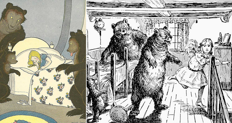
2. The three bears brutally kill Goldilocks.


Goldilocks and the Three Bears
Image source: 1,2

Today, the fairy tale of “Goldilocks and the Three Bears” is all about finding something that’s “just right,” but early versions of the story had a moral. The story was meant to teach a lesson about the hazards of exploring unknown territory and using the possessions of others. Originally, the main character was an old woman who was ugly, dirty, foul-mouthed, and inconsiderate. In one early version, when the bears get home, she tries to run away and breaks her neck. In another version, the bears throw her on top of a cathedral and she gets impaled on the steeple.(source)

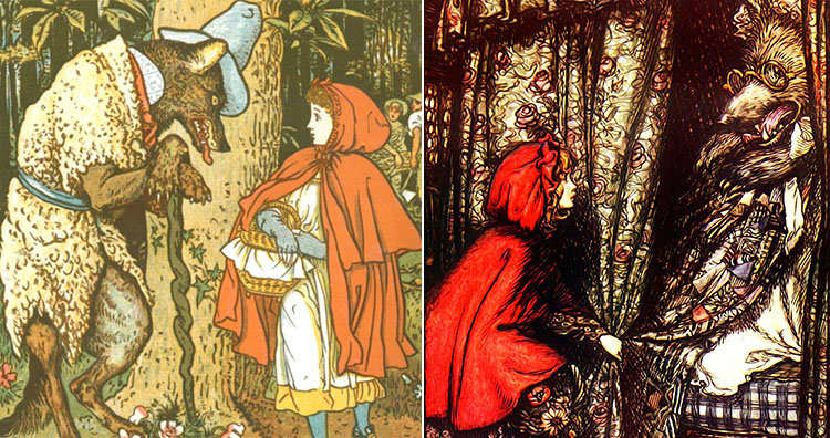
3. The wolf fools Little Red Riding Hood into eating her grandmother and then tells her to get naked before coming to bed.


Little Red Riding Hood illustrations
Image source: 1,2

In some early versions of the fairy tale “Little Red Riding Hood,” there was no huntsman to come to the rescue and no happy ending. Little Red Riding Hood was simply fooled by the wolf posing as her grandmother and ends up getting eaten.
Early versions also had some sexual connotations as the wolf asked her to remove her clothes and throw them in the fire before getting in the bed. In many early versions, the wolf also fools the girl into cannibalizing her grandmother as the wolf had saved some of the meat and blood for the girl to consume.
The earliest known printed version was recorded by Charles Perrault in 1697. This version ended with an explanation of the moral. It said that children, especially young and pretty girls, should not listen to strangers. It also warned girls to be aware that the most dangerous “wolves” often disguise themselves as gentlemen until they get what they want.(source)

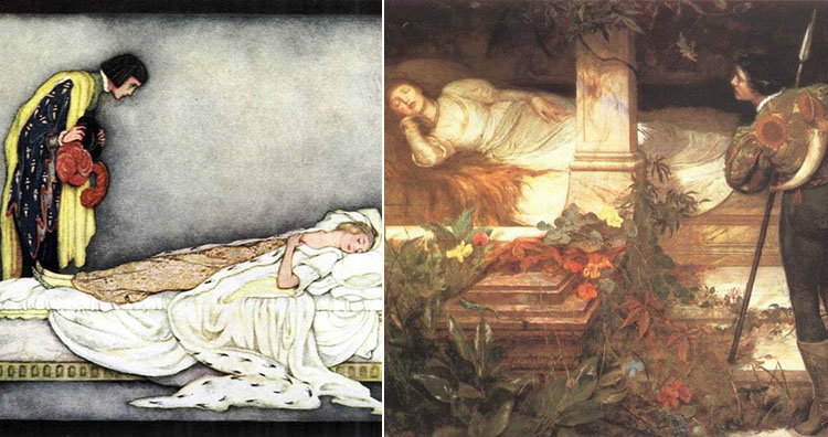
4. A king rapes Sleeping Beauty while she’s asleep.


Sleeping Beauty paintings
Image source: 1,2

One of the earliest versions of the fairy tale “Sleeping Beauty” was published in 1634 by Italian poet Giambattista Basile, and it was based on a number of folk tales. One major difference from modern versions is how the sleeping princess is awoken. In Basile’s version, a king discovers the sleeping princess and has sex with her. The princess gets pregnant and gives birth to twins while still unconscious. She finally wakes up when one of the twins is sucking on her finger and sucks out the splinter that had caused her deep sleep.
Another difference from modern versions is that the king in this story is already married. When the king’s wife learns about the twins, she tells a cook to murder them, cook them, and serve them to the king. The cook fools the king’s wife by serving two lambs instead. Then the king finds out about his wife’s plan and orders that she be burned to death. He also rewards the cook for saving his children. The newly-single king is then free to marry the princess and live happily ever after.(source)

5. The Evil Queen gets tortured to death at Snow White’s wedding. She’s forced to wear red-hot iron shoes and dance until she dies.


Snow White from Disney trailer and Evil Queen
Image source: 1,2

In modern versions of “Snow White,” the villain is Snow White’s evil stepmother. But in the version published in 1812 by the Brothers Grimm, the Evil Queen is actually Snow White’s birth mother. Similar to modern versions, the queen gets jealous that Snow White is more beautiful than her, and repeatedly tries to kill her.
The most shocking difference is how the queen dies. In the Disney movie, the queen dies when she’s standing on a cliff and a lightning strike makes her fall to her death. But in the Brothers Grimm version, the Evil Queen gets invited to Snow White’s wedding. When the queen shows up, she’s shocked to see that Snow White is still alive. As the queen stands frozen out of rage and fear, Snow White gets some gruesome revenge.
“Iron slippers had already been put upon the fire, and they were brought in with tongs and set before her. Then she was forced to put on the red-hot shoes and dance until she dropped down dead.”(1,2)

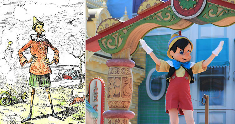
6. Pinocchio gets Geppetto sent to prison and then kills the talking cricket. The story ends with a detailed description of Pinocchio’s death by hanging.


Pinocchio illustration and parade
Image source: 1,2

The Disney film version Pinocchio had some dark themes, such as the part where naughty boys are turned into donkeys and sold into slave labor. But that’s nothing compared to the original story published in 1883 as the novel The Adventures of Pinocchio. That story was meant to serve as a warning against bad behavior, and so Pinocchio was depicted as an evil character with no redeeming qualities. For instance, Pinocchio starts kicking Geppetto as soon as the carpenter has finished carving his feet. Once he’s fully built, he laughs in his creator’s face, steals his wig, and runs away. The police then find Pinocchio and assume he was being mistreated, so they put Geppetto in prison. Pinocchio then returns home and kills the talking cricket that has lived there for over a hundred years.
Eventually, Pinocchio gets what’s coming to him as his enemies hang him from a tree. His death is described in vivid detail.
“Wind began to blow and roar angrily, and it beat the poor puppet from side to side, making him swing violently, like the clatter of a bell ringing for a wedding. And the swinging gave him atrocious spasms. His breath failed him and he could say no more. He shut his eyes, opened his mouth, stretched his legs, gave a long shudder, and hung stiff and insensible.”(1,2,3)

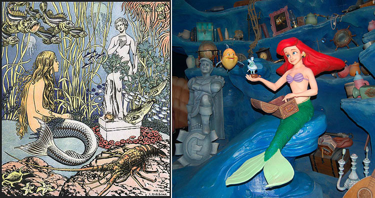
7. The Little Mermaid wanted to become human so she could have a soul. When it didn’t work out, she planned on killing the prince so she could go back to being a mermaid.


Little Mermaid illustration and display
Image source: 1,2

“The Little Mermaid” was published by Hans Christian Andersen in 1837. In the original story, the Little Mermaid learns that mermaids don’t have souls and dissolve into sea foam when they die while humans live on forever in the afterlife. So she decides she wants to become human.
In order to obtain a soul, she has to win the love of the prince and marry him. That way, part of the prince’s soul will flow into her. Her grandmother warns her if the prince marries someone else, she’ll die and turn into sea foam on the day after the wedding. When the Little Mermaid and the prince meet, he is mesmerized by her beauty and loves watching her dance. That last part is unfortunate because the mermaid’s human legs give her excruciating pain with every step, making it feel like she’s walking on sharp knives.
In the end, the prince decides to marry someone else. The Little Mermaid then has a chance to become a mermaid again by killing the prince with a sea witch’s knife and letting his blood drip on her feet. She’s about to kill the prince as he sleeps next to his new bride, but at last minute, she decides not to go through with it. So she dies and turns into sea foam. In the original version, the story ends there.
But the author later revised the story and added a happy ending. After the Little Mermaid dissolves, she becomes a spirit. She learns that because of her selflessness, she’s been given a chance to earn an immortal soul for herself. To do that, she has to perform good deeds for mankind for 300 years.(source)

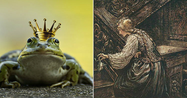
8. “The Frog Prince” was about a young woman overcoming her fear of male genitalia.


Frog in crown and Frog Prince illustration
Image source: 1,2

In most versions of this fairy tale, a princess accidentally drops a golden ball in a pond, and a frog offers to retrieve it in exchange for a kiss. When the princess kisses the frog, it magically transforms into a handsome prince and they get married. The moral of the story seems to be that if you keep your promises, good things happen. But some scholars say the story is really about a young girl maturing and getting over her fear of male genitalia. They say the frog is a symbol of a penis, and in early versions of the story, the princess promised to sleep with him. But she finds the frog so disgusting that it’s difficult for her. Once she gets over her disgust, she lives up to her promise and accepts him in her bed. Then she’s rewarded with a husband.(1,2)

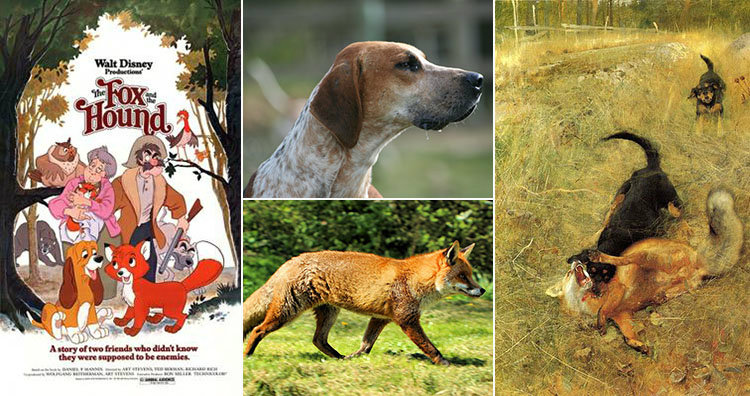
9. In the novel The Fox and the Hound, after the hound finally kills the fox, his owner decides to move to a nursing home where dogs aren’t allowed, so he shoots the hound.


The Fox and The Hound poster and painting
Image source: 1,2,3,4

This story is based on a novel published in 1967. In the Disney movie version, it’s a story about friendship. Copper the hound dog becomes friends with Tod the fox and prevents his master from shooting him, and everyone lives happily ever after. But things didn’t go so well in the novel. Instead, the fox lures one of the hunting dogs onto train tracks so it gets killed by the train. Copper and his master spend years hunting the fox to get revenge. Eventually, Tod dies from exhaustion after being relentlessly chased by Copper. By this point in the novel, Copper’s master is a run-down alcoholic who’s preparing to move into a nursing home where dogs aren’t allowed. So he takes Copper outside and shoots him with a shotgun.(1,2)

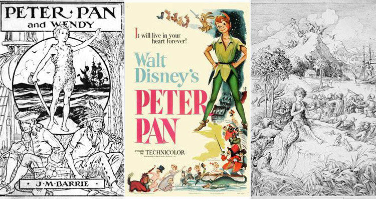
10. Peter Pan murdered some of the Lost Boys when they started growing old.


Peter Pan posters
Image source: 1,2,3

Peter Pan was originally a play that premiered in 1904, and the playwright also turned the story into a novel that was released in 1911. In that version of the story, it’s implied that Peter would sometimes kill the Lost Boys if they grew too old. In the novel, staying in Neverland only slowed down the aging process, it didn’t completely stop it.
“The boys on the island vary, of course, in numbers as they get killed and so on; and when they seem to be growing up, which is against the rules, Peter thins them out.”
The story also vaguely implies that Peter would disfigure the Lost Boys to get them to fit into their hideouts inside hollow trees.
“You simply must fit…but if you are bumpy in awkward places or the only available tree is an odd shape, Peter does some things to you, and after that, you fit.”
But this didn’t mean that Peter Pan was evil. Instead, he was depicted as an innocent character that couldn’t understand the consequences of his actions. In order to stay childlike, Peter Pan had to always live in the moment. He would do whatever occurred to him at the time and forget about it immediately afterward. In this way, the story showed how it’s important to eventually grow up. (1,2)

Comments system

[blogger][disqus][facebook]

Disqus Shortname

sigma2

Post Bottom Ad

Responsive Ads Here